Driving engagement through workflow-embedded intelligence
TIMELINE
July 2022 (2 weeks)
TEAM
1 Designer (me 🌺)
2 Product Managers
1 Engineering Manager
2 Front-End Engineers
SKILLS
Product Design
Product Strategy
Interaction Design
Prototyping
User Research
my impact
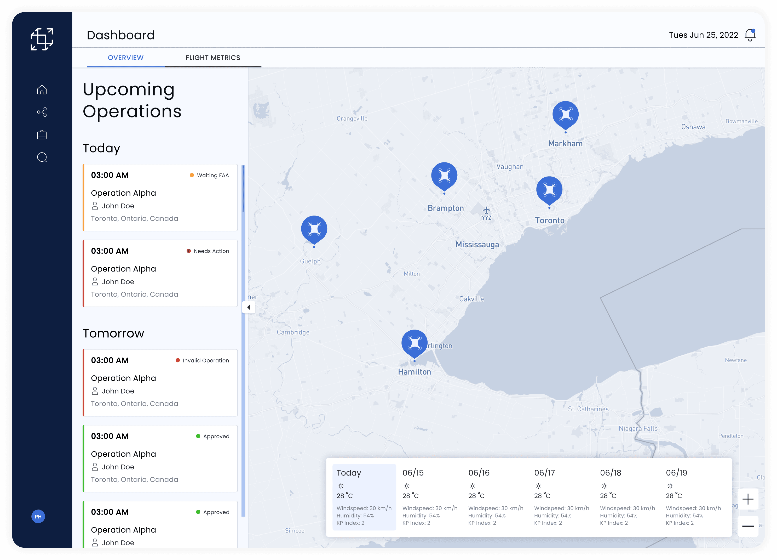
Shipped Scalable Widget to Standardize Weather Intelligence
previous design

new design

I was the lead designer into transforming a legacy weather component into a weather widget that successfully shipped and scaled beyond its original scope.
Not Just Shipped, But Adapted Across Other Product Offerings
screenshot from airmatrix's website
Originally designed for the enterprise product, this widget was further adopted into the government product, expanding its role across Airmatrix's product ecosystem.
ps i did this too!
I led the redesign of the dashboard experience that helps drone operators monitor planned operations
Please reach out if you would like to learn more!
spoiler alert
Context
AirMatrix Helps Drone Companies Plan Flights in Urban Canada
AirMatrix provides a range of digital products that assist in drone flight planning and airspace management. I designed for the enterprise product, which was dedicated to helping commercial drone pilots create regulated flight plans and gain government authorization.
problem
Users were neglecting the weather widget...

Heatmap Research (Data redacted)
Heatmap research done previously showed a lack of engagement on the weather tool.
... even though weather information is critical to flight planning
Rooted in user feedback, the feature was initially added to surface weather insights that operators found crucial for flight planning.
Weather conditions represent the most significant operational challenge for professional drone pilots, affecting everything from flight safety to data quality and equipment longevity
👤 flybyguys.com
additionally, the current design was outdated and cluttered
The weather widget was designed during the very early stages of the startup, when the design system was still loosely defined. As such, it no longer adheres to the design guidelines implemented across the rest of the platform.
Constraints
My design ticket looked something like this 👇🏻
TASK

Melissa Chan
challenging assumptions
On first glance, this is a purely visual task, but I quickly identified an issue,
This task assumes that the outdated UI is the primary driver of low engagement, and that modernizing the visual component will solve the problem.
My instincts told me there might be more to the story.
QUICK SANITY CHECK
A quick competitive research revealed that the current design aligns more with traditional weather apps than weather shown on drone apps

Visual comparison of weather data
The prioritization of temperature, low information density, and weather icons for the sake of scannability is shared between traditional weather apps and the widget design.
In contrast, drone apps show technical aviation metrics in a dense, tabular manner, optimizing for utility.
I wondered…
Was it due to technical constraints, or an oversimplification of user needs?
Could it be that the weather component served a different purpose than that found on other drone apps?
the aha moment!
During my research, I identified an untapped opportunity that could substantially strengthen our value proposition as an end-to-end drone flight platform
I dug through the archives and found the original ticket - the initial intent was to help users out during the flying stages where current weather was critical

Original Ticket (Data Redacted)
This partially explains why it was initially designed to be scannable, similar to a lightweight consumer app rather than a technical weather tool.
Our tool has since shifted its focus to the planning stages, meaning that this scope no longer covers our user's most important needs

Product Description
By capturing this gap, there is a huge opportunity to create a smoother user journey that will strengthen our value proposition.
reframing the problem
The new design needs to account for the needs of users for both the planning and flying stages
FLYING STAGE USERS
Solution: UI Update to Match Design System with Improved Hierarchy

The dashboard is the first thing that users see. For users in the flying stage, their utmost priority is scannable information about current conditions.
Only metrics that were already available were included with this update due to engineering constraints
Planning STAGE USERS
Solution: Providing a Seamless Access Point for Weather Data in the Core Planning Workflow

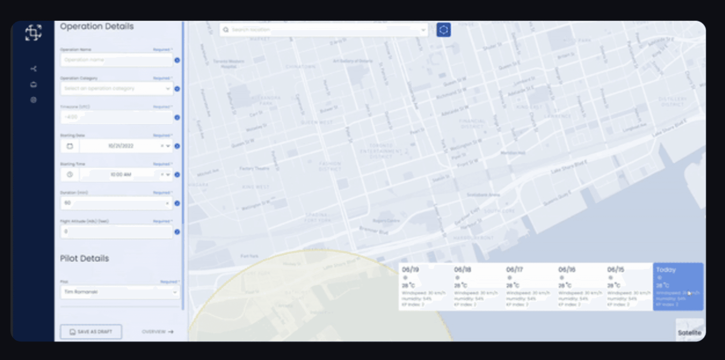
Added Weather into Operation Planning Page
Jumping out of the page level, embedding weather data directly into the flight planning tool gives users continuous access to critical data right when they need it.
Decision: Inclusion of Forecast Weather into Weather Component
Forecast Weather
For planning stage users, predictive weather data is much more important than current weather. Great to know it's sunny right now, but what’s happening on the day when the flight actually takes place?
A 6-day weather forecast was included as that was the amount of data that we previously displayed.
Pulling even more data = more engineering effort!
Future Proofing: Showing Multi-Day Weather Forecast
carousel
Click to Expand
I mapped out future concept explorations to show how the weather component could scale over time.
Decision: Always Visible Weather Component
HIGH
Levels of Visibility
LOW
[option to toggle visibility with Icon button]

Always Visible (Chosen)

Visible by Default

Hidden by Default
Since the map component was a large part of the flight planning process, I considered how visible the weather component should be on the map.
Considering the critical role of weather data and amount of engineering effort required to develop interactive states, we opted to keep the weather data always visible.
XFN COLLABORATION
Communicating the Quick Win and the Scalable Solution

An evolving product roadmap
By just aligning the weather component to the current design system, we can complete one of the project objectives while building up the foundation for a more scalable solution.
In the meantime, we can collect platform analytics to evaluate success.
Project Objectives
Drive engagement
Visual alignment
If there's time, we can proceed to the addition of the weather component into core workflows
The expanded weather forecast component is a modular design that builds upon the visual upgrade. By embedding it directly into the planning flow, we eliminate tool-hopping and keep critical weather information situated right where the user needs.
This ensures a smooth user experience and eliminates any mistakes that might arise due to confusion from switching tools.
Redefining success
The success of this solution cannot be directly evaluated with engagement (number of clicks as previously defined)
The weather forecast component cannot be interacted directly with the user, which means that it is difficult to evaluate whether the project objectives have been met.
I recognized that behind engagement, the true goal was to ensure that users are able to leverage all the tools available to complete flight planning accurately and efficiently
I redefined success as
some metrics to track could be…
Task Completion
Task Correction
Session Length
Tab Switch
Reflection
This project made me learn…
What was originally a visual upgrade of a page-level component became a system-level addition. As a designer, I have to stop looking at components as isolated UI elements and start thinking about how they affect the entire product experience.
I learnt to consider how a component could evolve over time (e.g. addition of even more forecast data) to reduce design debt down the line and created a stronger foundation for scalability. This also increased stakeholders' confidence in how a design could integrate with future features.
🌺 Checkout my other projects!
#2 INTERAC
🧪 MVP DEVELOPED